SP Angel
A modernised logo to drive a communication refresh
WHO
SP Angel is an independent partnership that helps clients build better businesses through their creative investment banking solutions and detailed regulatory knowledge.
CHALLENGE
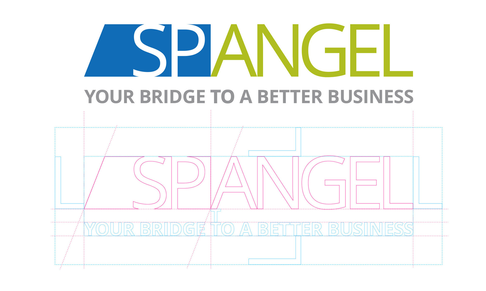
FourthQuarter was commissioned to re-design the company brand, this involved developing the logo which had lost its integrity over a number of years and evolving the wider communication style for the business.
SOLUTION
All five partners of SP Angel needed to be fully on board with the new logo and design approach, so we took them through several alternative routes for the logo to demonstrate the range of options they had. These included alternative typography, shapes, colours and symbols, all of which helped to modernise the marque and give it meaning.
IMPACT
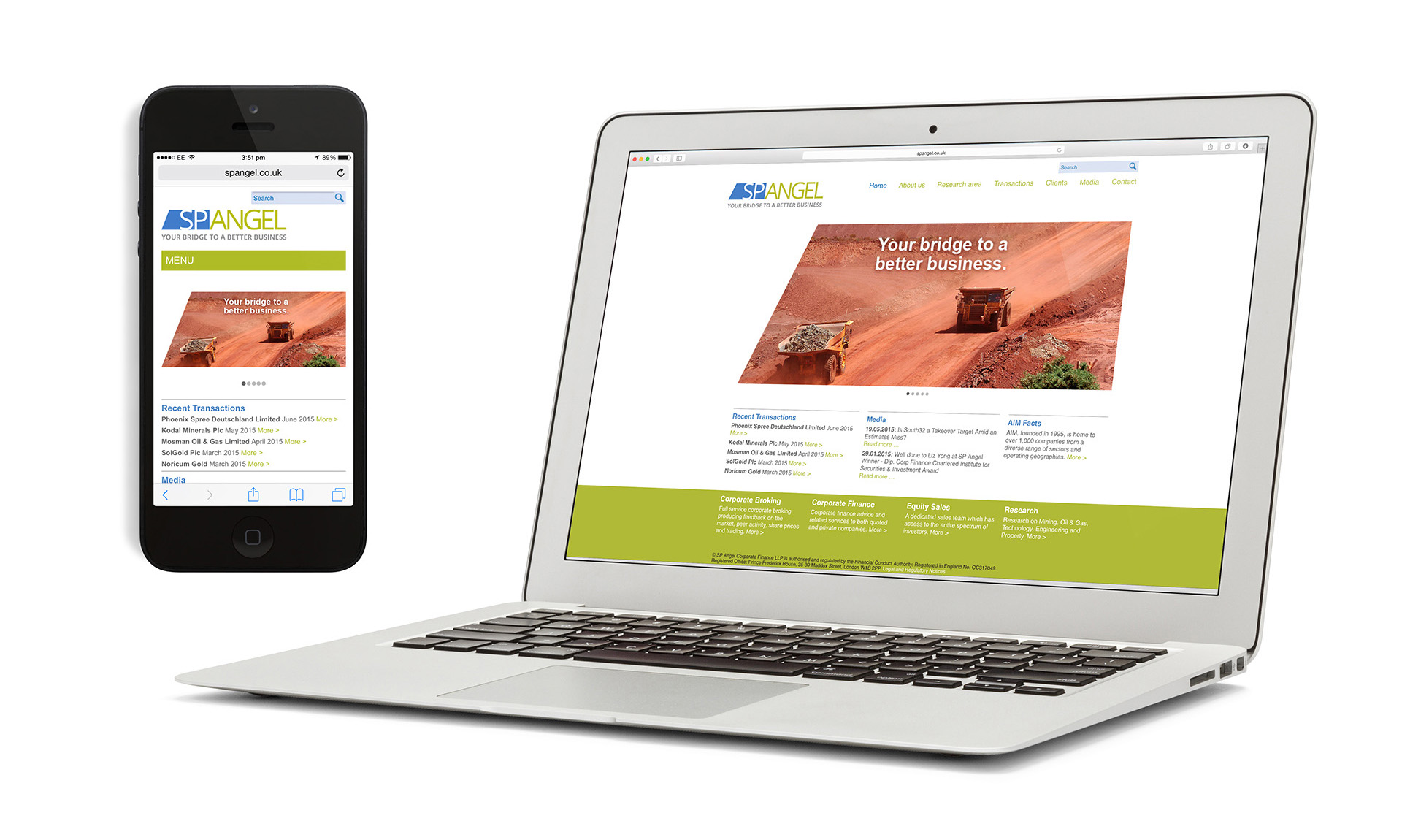
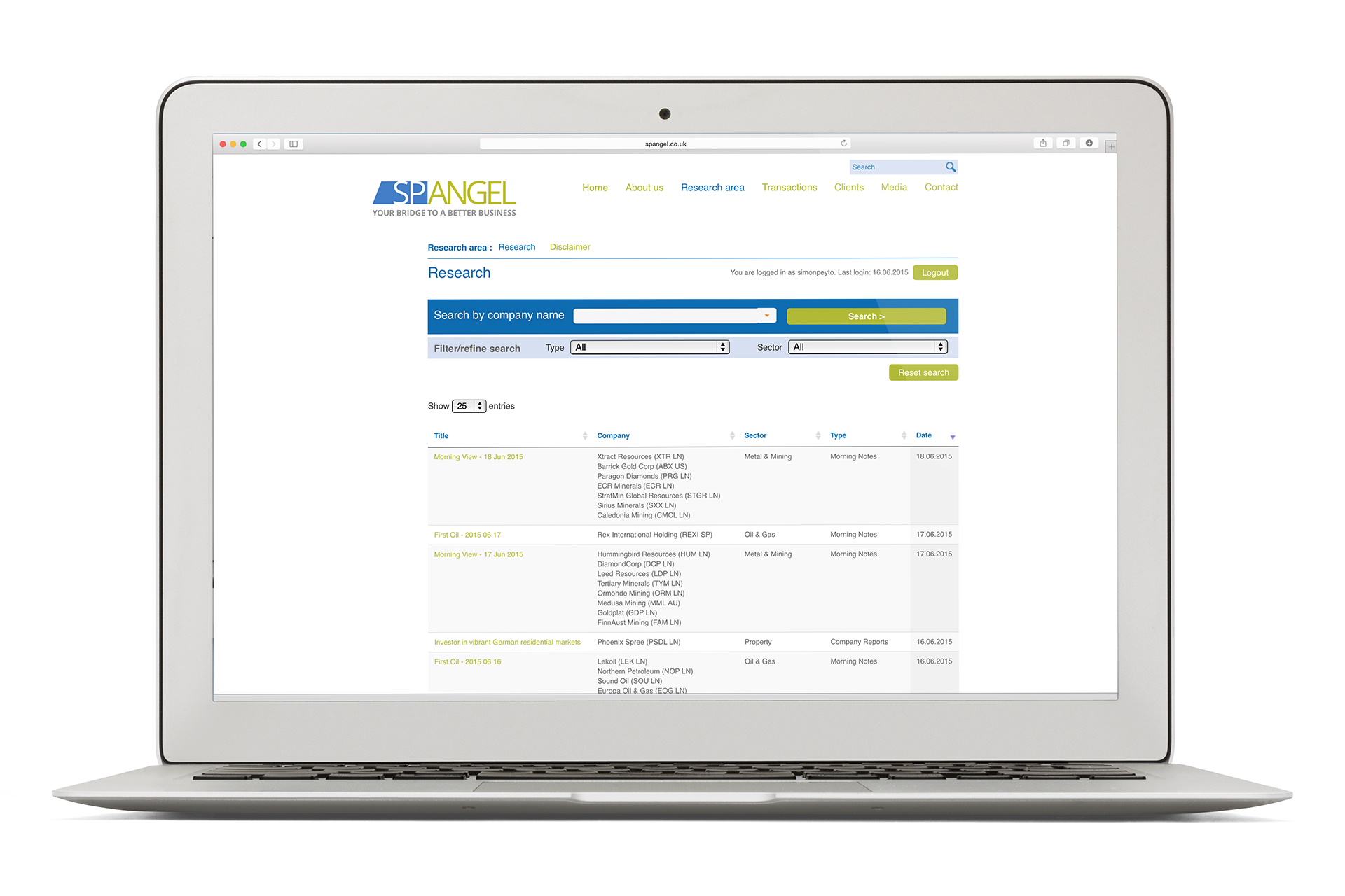
The new logo selected steered the overall look and feel for the company and we developed it across company stationery, PowerPoint templates, exhibitions, client market reports and their website.


